 |
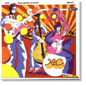
Oranges & Lemons But Skylarking was a success for us. And did open the American market, accidentally for us with "Dear God." So we were making Oranges & Lemons thinking, "Wow, the world is our lobster. Give us a crack at it." ~ Andy Partridge |
|
On September 12, 2002 ~ Andy
and I discussed the most florescent XTC album cover.
|
| AP: Oranges & Lemons, I knew was a bright collection of songs. I knew it was pretty up and kind of poppy. Just by all the demos you know this is going to be a bright collection of stuff. Initially it was going to be called Songs Of Sixpence, and the cover was going to be something of a nursery rhyme type thing. But working in LA... I still liked the idea of the nursery rhyme thing, but I don't know. Being in LA, it's like everything looks sort of bright and citrusy. And just the idea of Oranges & Lemons itself being a nursery rhyme, I thought, "Yeah, so we still keep the nursery rhyme connotation but Oranges & Lemons kind of suits the slightly acidic, slightly tart taste. But it's very zesty and it's very up. It's the perfect title. But hell, what do we do for a sleeve?" The last thing I want to show is kind of like palm trees and people driving around in LA. That's just not us. That's not what we're about. And I was talking with Dave Gregory and I said, "Have you ever fancied having a really kind of poppy sleeve? 'Cause I think a lot of this stuff is coming out very poppy. You know, "What pop sleeves do you like?" And we agreed that one of the best sleeves that, I |
|
|
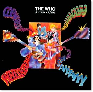
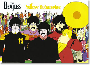
suppose getting back to what you said, that looked like what was inside, was The Who's A Quick One. WL: Sure. AP: Where you get these... it was pre-Yellow Submarine. Was it Alan Aldridge who did it? WL: I don't know. AP: That rings a bell. Again, one of those artists who contributed heavily to The Beatles Illustrated Lyrics. I think it was Alan Aldridge. And just the look of it, with these kind of bendy guitars and this sort of cartoon bubble-gum type band situation. And we both agreed that it was a great looking sleeve, and wouldn't it be good to do something that was just pure pop, like that? And again, I found it in a book. You know, I had a day off and I went into a bookstore in LA and I found |
|
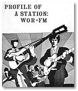
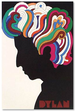
this book that was like a collectors book of modern day antiques. And in it was a poster by Milton Glaser. WL: Now, I'm familiar with that name. AP: And it was for a radio station. It was done in 1966 and it was for an American radio station. I can tell you what the radio station was because I've got the book behind me. [searching] There it is. It's called Tomorrow's Antiques, that's the book. And it's sort of modern day stuff that I liked, because it's just a whole mess of illustrations. And under the pop and rock section there's a poster by Milton Glaser, and it was for a New York radio station. And the station was WOR FM, 98.7. And if you can find a copy of that poster, - that basically was the jumping off point for Oranges & Lemons. You've gotta go and find that now, 'cause |
|
|
once you see it you'll go, "Christ, that's pretty close in feel." I saw this in there and thought, "Well, that would be a good place to start." That's got that sort of a feel of A Quick One. And I also love the art of Heinz Edelmann, who designed Yellow Submarine. And he had a book out called Andromedary SR1, [contact me if you have info!] and it's the story of a spaceship. And I loved the way he illustrated it. It was just Yellow Submarine style. I sat down again with Dave Dragon, from Design Clinic, when we got back from LA. And I said, "Here's my sketches. So, if we can smash together this WOR poster and some of the Heinz Adleman stuff from this book, Andromedary SR1, I think that will give the feel that we're looking for." And actually, what he did was, he literally took the character from the left hand side of the WOR poster, which became me in the picture. He hasn't got a face, which I |
|
quite liked. And he had the head of the guitar turn into Adromedary SR1, which is the little spaceship that's flying off to the right. And then he took lots of bits and pieces from the Andromedary SR1 book. Like the way the shoes were drawn, and things like that, and smashed them all together. We took the red and white sun-ray background from the WOR poster, and that became the background to it. It's really just a screwing together of those elements. WL: I'll have to find that poster. AP: You should find it on the net actually, somewhere. But, you've got all the details now so happy hunting. WL: [laughing] AP: When you see it you'll go, "Whoa, there you go! There's Andy!" So that came out very well. It just, I think had the feel of the music inside. You know, it had the bright citrusy, zingy kind of feel. And we were on a big high ourselves because Skylarking was a success for us in the states. Virgin didn't pull the plug on us. They didn't drop us. They said if Skylarking wasn't a success they were gonna throw us off the label. And we found that a bit scary. WL: Oh, I can imagine. |
|
|
AP: A few years later, it would have been delightful to have been thrown off the label. [laughter] But we found that a bit scary, and obviously had the idea that we'd failed in some way. But Skylarking was a success for us. And did open the American market, accidentally for us with "Dear God." So we were making Oranges and Lemons thinking, "Wow, the world is our lobster. [laughter] Give us a crack at it." |
|
In late 2003, Andy told me
a bit about some Oranges & Lemons single covers.
|
| WL: How about the cover of "The Loving"?
AP: Oh, right! That could have been one of a hundred things. I actually wanted to do several sleeves for that but Virgin couldn't be bothered, they just wanted the one sleeve. I don't know whether you've seen it? There's been a page from one of my sketchbooks reproduced which has lots of ideas for "The Loving" symbol, with this big red heart. |
|
WL: I don't think I've seen that. AP: I'm trying to think where some of them were reproduced. I think a couple of those pages got into that Neville Farmer book. WL: Song Stories? AP: Yeah, Song Stories. WL: If it's in there, I've seen it. AP: But I basically wanted to make it like an ad campaign using this symbol of this red heart. And I was sketching where it would be. It would be on, like |
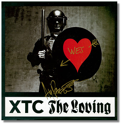 |
soap powder boxes, or maybe the flags of the world would be changed to look like they had this heart symbol involved. So I had the red bars on the Union Jack bent around to form a heart, and stuff like that. I had it as decals on the side of an Army helmet. You know, just all sorts of things. Superman pulling open his Clark Kent outfit revealing that on his chest was this big red heart. WL: Now, I think I've seen that. AP: And I couldn't decide which one to go |
|
for and thought "Well, maybe we should go with several sleeves that have the red heart image. Then again, I thought "What better than to actually put in a context that is the opposite of "The Loving" that might highlight it more." So I picked a kind of faceless dark looking violent figure of impressive authority and stuck it on the shield. WL: THERE WILL BE THE LOVING, OR IT WILL BE YOUR ASS! AP: [laughing] YOU WILL HAVE THE LOVING! I kind of liked that juxtapasition of images. WL: It's a great contrast. AP: Almost like they're forcing this on you. If you're not going to accept it they're going to force it on you. But I just wanted to show that symbol. As I say, it was intended originally to be part of an ad campaign where you'd see many different covers with stuff with that symbol on it. WL: That's a neat one. You autographed a copy of that and sent it to me actually. AP: I don't remember. Moi? [laughing] |
|
|