 |
Drums And Wires I think, with Barry leaving we had to reinvent ourselves. Because in a lot of peoples minds Barry was the sound of the band. He was - if not the look of it, certainly that slightly space-age fun-fair kind of sound. And when he left, it was like - whoops, there goes the sound of the band. ~ Andy Partridge |
|
On
September 12, 2002 ~ Andy and I discussed XTC's most recognizable cover.
|
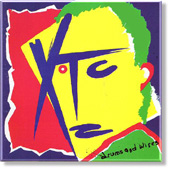
| WL: The cover for Drums and Wires. That's
probably the most recognizable XTC cover.
AP: Yeah. WL: Maybe English Settlement. AP: Yeah, I guess so. I guess that one and English Settlement were the two. I was working on a design where XTC was a sort of a savage looking primitive face, as if they were looking over their shoulder at you, or sort of a... What do they call that, like a three-quarters view of a face or something? And I quite liked the idea of the letters, the X - T and C, and the little underline there actually making the features of |
|

|
the face. And I did a rough version, and we were in the studio and I didn't have time to do any finished artwork. So we got together with a girl, I think she was working at Design Clinic at the time, who did a lot of our sleeves. And I went up to the pool room, where they're in a break, and said, "Okay - here's the sketch. I want it done in real primary colors. And then the back I want done in more muted kind of khakis and browns. But on the front I want really, really bright primaries." And she took away this sketch and I think she just cut it out of colored paper or something, originally. And reproduced this little sketch in terms of just these big bright flashes. And that's really all I can tell you about that one. And quite a few people had written in saying, "We want the lyrics to your songs, and we can't get them anywhere." And so we decided, with the little insert that went with Drums and Wires, to actually put the lyrics of the previous two albums on. 'Cause people had complained saying they wanted our lyrics. So that's why you got lyrics to songs that weren't on that album. WL: An abrupt change too from the black and white of White Music & Go 2. Suddenly, bolder music and a bolder cover. AP: I think so. I think, with Barry leaving we had to reinvent ourselves. Because in a |
|
lot of peoples minds Barry was the sound of the band. He was - if not the look of it, certainly that slightly space-age fun-fair kind of sound. Which, you know I was really keen on as well. And when he left, it was like - whoops, there goes the sound of the band. What are we gonna do now? It was time to reinvent ourselves. So the highly colored sort of primitive cover was reinvention, it was time to reinvent. And TOTO went ahead and stole that, and got an award for it. [laughter] You know TOTO? WL: Oh yes, definitely. I know the album you're… AP: Yeah, the sleeve where the letters TOTO make a face? I think they got an award for that. But sometimes, in these books of the greatest album covers, you see things like Drums and Wires or Black Sea. And you know, Shitzo here never gets credited. It's always - Jill Mumford - was she the person who cut out the colored paper? I think that was her name. WL: The names are coming back to you. |
|
|
|

|
graphic thing to do. And the other thing, on the other side was again yellow and black. It was a box of very famous matches in England called Ship. It was sort of an old sailing ship popping along on the front cover there. WL: Was that actually the brand of the matches? AP: Yeah, it was called Ship. Not Boat. They're just called Ship matches. You can still get them. At the time the box was just yellow and black, so I thought we'd take the ship and change it to "Wait Til Your Boat Goes Down". And we have the famous little Ship brand sinking beneath the waves there. A kind of symbol of reliability suddenly is not reliable anymore, it's on it's way down. Everything you thought was going to be reliable and stable forever is suddenly upended, and down it goes. Which was sort of the sentiment behind the song. You think that everything is gonna be fine for you all the way along and when it all goes crap for you, don't come running to me because you've |
 |
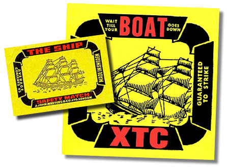 |
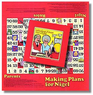
dumped me. So, I thought it was kind of neat. A very simple little thing, having a reliable English brand - Ship matches - but showing them actually sinking. WL: It's a nice logo - very strong. AP: You've got to look for a little box of Ship matches now. WL: Yeah, I've seen them before. I'll have to see if I can find some for the images. How about "Making Plans for Nigel"? AP: Well, that one was done at a time when I was really trying to wrestle control of all our sleeve art. And we were touring very heavily, |
|
nonstop. We didn't have time to do our laundry, or anything. So, anything that I could do with sleeves I'd have to phone in from wherever we were on tour. I'd have to try and post in sketches, or whatever. And it was all snatched on the hoof really. But I liked the idea of having an interactive single bag, where you made decisions on Nigel's life and played it as a game. I remember somebody giving me a book of Victorian parlor games, reproduced in a large format so you could replay them. And part of the artwork in there was this Victorian family all sat around the table, and a very swotty looking boy who you could just see was totally under the dominance of the mom and dad in the picture. And I said, "Can you find that book and look at that picture, and can we redraw that kind of scenario so it looks like a rather Victorian looking board game with this very swotty looking kid?" Except I honestly don't think they bothered to do that. I can't remember who did the sleeve for us at the time, but they obviously didn't bother to look at that reference I was asking them to go and look at. Because they just drew this thing that really, honestly looked like my mother had drawn it. |
 |
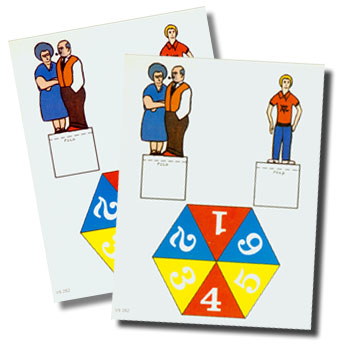 |
WL: [laughing] You say that as if it were a bad thing. AP: It's a bad thing. [laughter] It just did not come out stylish at all, and the game inside is pretty dull. And that kind of offended me because on any time off that I got I was crazy about making games. Unfortunately, because we were touring I just didn't have the time to put together the mechanics for the game inside. It did come out very disappointing, and they didn't do their research. But I wanted it to look like an old Victorian parlor game where you get to control Nigel's destiny in life. |
|
|
|
|