 |
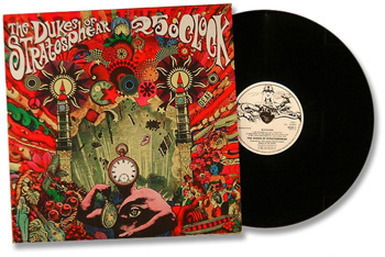
The Dukes of Stratosphear They did it. And sent me this cover for approval. And I said, "This isn't right, this is just negative." And Virgin said, "Well there's no time to change it now. It's already gone into production, too late." There you go. ~ Sir John Johns |
|
Optimism's
Flames Exclusive ~ Sir John Johns and I discuss the psychedelic cover
art of the Dukes... 12/02.
|
|
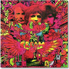
SJJ: 25 O'Clock? Whew, boy. Let me see. Never has my old kitchen table seen so much photocopying, gum and scissor-action. I knew that the Dukes should have a kind of an amateur looking sleeve and I liked the sort of well-meant, kind of magazine-y looking Cream collage. Obviously the scissors had been flying that day as well. I really liked the cover of Disraeli Gears. And, you know, he'd obviously got his fluorescent paints out and he'd been snipping around and drawing stuff, and adding stuff in. So I thought, "Yeah, this is a kind of way to go. So the Dukes need something of that nature." So I just took a load of copyright free books with symbols and patterns, and then a few un UN-copyright free books... WL: [whispered] Gasp. SJJ: [laughing] Yeah, criminal. Dragnet music playing in the background. [returning to original topic] ...old advertisements, old Victorian adverts or old fifties adverts. You know, some engravings. All sorts of bits and pieces. And |
|
|
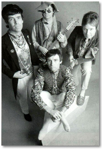
I took a whole bunch of these 'round the photo copy place and said, "Copy that twice the size, or half the size, or do me ten of those," or whatever. I brought back reams of paper. Got the scissors and gum pot out and got a big piece of card and cut around random stuff, and added some hand-drawn stuff in as well in the Martin Sharp tradition. I ended up with a black and white artwork that I was pretty pleased with. And I also did a back as well in which I drew the faces - our faces. I basically took photographs that we had of us and messed 'em around a bit - like, gave me some more kind of Benjamin Franklin glasses than the usual oval ones. And got hold of a picture of Dave's brother Ian as well, and added him in. So it was like well-meaning amateur art, kind of on the Disraeli Gears front. |
|
WL: I love that cover. SJJ: And then I sent it in to Dave Dragon from Design Clinic, who did a lot of our sleeves up until a few years ago, when they just got too damn expensive. And I said, "Could you color this in the style of Disraeli Gears? You know, I don't want to ruin it with the wrong inks. Or I don't want to use the wrong stuff that's not gonna show up under the photography, or the fluorescent is not gonna register, or whatever. So you use the inks that you're sure are gonna register okay, and just color this." So I sent him the most psychedelic black and white coloring book he'd ever seen. [laughter] And he just had to fill it all in. But it looked pretty good. And it came out in the feel I wanted; that amateur collage look. WL: Well, it's a great cover. It's actually one of my favorites. SJJ: Oh really? People have said all sorts of things. They say if you look at it after you've taken too much Drano you can see this awful screaming face. 'Cause they say that the two Big Bens, or whatever, on each side... the bits at the top… I haven't got a copy of it now to look at, so I'm just using my memory... |
|
 |
WL: I've got a small print of it here. SJJ: They say it looks like eyes. WL: Yeah, I can see exactly what you're talking about. The clock on the face actually looks like a nose. SJJ: There you go. Well they say it looks like a sort of upset face. That was just purely coincidental. WL: What a grand coincident. SJJ: People have said they can read stuff in it. They can read words in all the scribble and the wiggles. That's just pure... You know, they're on drugs. [laughing] |
|
WL: I'm looking at it right now and it's chanting, "Kill - Kill." SJJ: It's chanting, "Kill Andy." [laughter] No, it's chanting, "Go to Swindon and buy Andy a really nice meal." [laughter] Definitely not "Kill Andy," be nice to Andy. Go and give him access to your bank statements! Just to leap on a bit - Psonic Psunspot, which for a while was gonna be either Knobstick Knebula or [thinking] - what was one of the other titles that we were playing with? WL: [still trying to digest this title] Knobstick Knebula? SJJ: Knobstick Knebula. It was going to be that for a short period, until we sobered up. WL: Until you came down off the Drano. SJJ: For a while it was Psonic Psunspot Pstockade, and then the Pstockade |
|
|
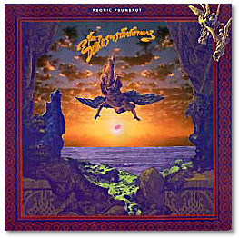
got dropped. It was a little bit too long. But the sleeve... One of my favorite psychedelic artists of all time, who again works in collage, is the Japanese character Tadanori Yokoo. WL: Do not know him. SJJ: And he's worth looking up, because once you see a collection of his work... "Ahh, there it is; Psonic Sunspot!" You can see the feel. What he does is he takes bits of [Gustave] Doré print or matchbox art, or pieces of photographs of stuff, and just cuts them out and shifts them round 'til they look great and pastes them down. And again I got together with Dave Dragon and I said, "I want the outside front to look like a Tadanori Yokoo thing." And we went through a lot of books of Doré prints. I think the sea and the flying angel were from a Doré. And I said, "Let's have a little center point, like a sun. We'll make it really psychedelic, we'll have an embryo in the sun." That sort of stuff. And he said he had a freaky postcard from somewhere that had a sky that was reproduced again in mirror image. And so we used that basis. But basically it's a piece of fake Tadanori Yakoo. A few people have got this. In fact, Storm Thorgesen, there's a name, who was head of the Hipgnosis label rang me up just to say how great it was. He spotted that it was a fake Tadanori Yakoo. And I was really pleased that somebody in the art world actually got the |
|
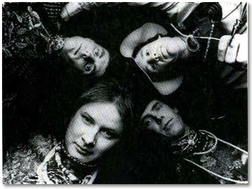
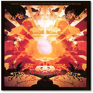
homage. Then, inside, we'd had a couple of photo sessions done and one part of one photo session was to disguise us because I still didn't really want it known that the Dukes were us. We had a photo session done under liquid light wheel; you know, an oil wheel. And I said I wanted words and stuff inside the gatefold. Has to be a gatefold, because all psychedelic sleeves, good ones, are gatefolds. And useless gatefolds! [laughter] It doesn't add anything to the sleeve at all. So I said, "We'll have a useless gatefold with this photograph." And then the wording was, for all intents and purposes, lifted from an album by a group in the late sixties called Hapshash & The Coloured Coat. Where they use this kind of ribbon-y lettering that was then flipped backwards as well. One way it just looked like a bunch of floating ribbon in the air and the other way around it looked like the actual words. I thought that was one of the better psychedelic sleeves. WL: I'll have to find that one. SJJ: The music is appalling, truly rotten. But the sleeve is really a |
|
 |
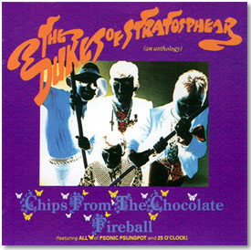
psychedelic gem. It's just worth having for the sleeve, but don't put the disc on; you'll be very, very upset. [laughter] WL: What about the anthology, Chips From The Chocolate Fireball? SJJ: Well, that actually was a terrible mistake because they said, "We want to put both of these together on a disc." And I said, "Okay, we better make it an anthology type thing." And I came up with |
|
a title. And I said, "Can we take one of the photographs from the photo- session and solarize it?" Now, solarizing, for people who don't know what solarizing looks like... If you see the front cover of [Frank Zappa's] Hot Rats, the picture of the girl on the front cover, that's a solarized photograph. I'm sure of it. It's either solarized, or some other technique which I'm not sure of the name of, where colors are basically changed. You know, greens become pink, blues become yellow, and all that sort of stuff. It's almost like a color reverse type thing. I guess solarized isn't the right phrase, but that's what I thought it was called. They did it. [laughing] And sent me this cover for approval. And I said, "This isn't right, this is just negative." And Virgin said, "Well there's no time to change it now. It's already gone into production. Too late." There you go. WL: Well it's still nice and psychedelic. SJJ: [in streetwise mob voice] Hey, I was robbed! |
|
|
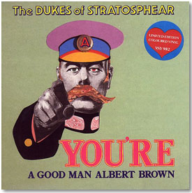
WL: And these days it's easy to achieve most of those effects with Photoshop. SJJ: Oh sure, yeah. It's piece of piss now. I think then it was more a case of, you just had to open the door a bit more. You know, put the wrong chemicals in the developer and stuff like that. WL: How about some Dukes singles? SJJ: "Mole From The Ministry" was taken as a single, very foolishly I think, but taken as a single from 25 O'clock. On that I said, "Can we have the earliest Virgin artwork logo you can get your hands on?" So it looks like it could have been one of the very early Virgin things. Probably before Virgin Records even existed, actually. Because I think Virgin Records probably came into existence, I may be wrong, but was it 1970? WL: Couldn't have been much earlier than that. SJJ: "You're a Good Man Albert Brown" was maybe supposed to come out in early '68 or something. But we went for this early Virgin logo, which sort of gave it that cheesy Roger Dean post-psychedelia kind of thing to it. And "You're A Good |
|
Man Albert Brown," I've always wanted to do a sleeve with a kind of, I was Kaiser Bill's Bat Man, I was Lord Kitchener's valet sort of look to it. You know, that whole fascination with Edwardiana that psychedelic bands had. Which is the reason the whole Sgt. Pepper's thing was placed as a kind of pre-First World War marching band. That was the current fascination with Edwardiana really. It's why everybody were wearing these old military uniforms, you know, pre-First World War guardsmen outfits or czar jackets. The whole thing in vogue in the mid to later sixties was that Edwardiana look, certainly in England but I think in America as well. I wanted to do a sleeve that sort of reflected that, so what better than to have the old closet queen himself, Lord Kitchener pointing out, saying [in effeminate tone] "Oh yes, I want you loves. You, you and you, strip off now." [laughter] So I thought, yeah we're just going to have Lord Kitchener with the "Your Country Needs You" poster. Instead of the great big "You" we'll have a great big "You're," because the song is all about my granddad in the First World War. So, what better than a First World War poster |
|
|
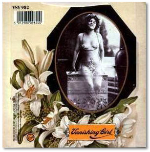
psychedelicized? WL: Good cover. SJJ:Yeah, it's not bad. It worked perfectly. And then "Vanishing Girl" on the other side was an attempt to... I vaguely remembered The Who when they did "Pictures of Lily" having these spreads of all these naked girls of the naughty nineties, that sort of thing. You know, sepia fat nude women near bicycles, and stuff like that. WL: [lustfully] Stop it. SJJ:[laughter] Oh, bicycles! Oh, tandem! I was happily married and I suggested to my wife we buy a tandem. She was disgusted! So we went for that kind of "Pictures Of Lily" look. And I got Dave Dragon and Ken Ansel at Design Clinic to alter an old black and white, sort of naughty nineties type girl so that she was in fact vanishing. So we have a Vanishing Girl. |
Jan 2005 Update... |
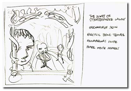
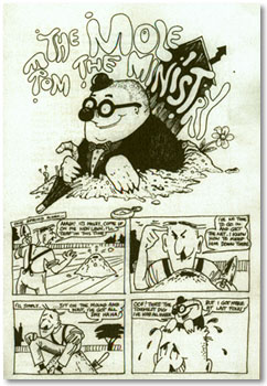
| In late 2004 I got an email from Mark Fisher, the man behind the wonderful XTC fanzine Limelight, with a header that read "My past is in the post." I got the package at Christmas, and it was far and away the best gift I got that year. Inside were dozens of original 8" x 10" unpublished photos from publicity sittings as well as candid shots taken in studio, most of which I'd never seen before. The sketch by Sir John Johns to the right was one of several included in the box of goodies from Mark and shows an early idea for the cover art as well as five notions for the name of the band. There are hundreds of things that will be added to the site that were contributed by Mark, and I cannot thank him enough for entrusting me with these wonderful items. wesLONG |
|